Aritzia
A creative design concept for physical, branded merchandise. The aim was to find more avenues to showcase the Artistic License series while representing Aritzia’s values in Everyday Luxury.
Roles: Graphic Design, Photo Editing
Tools: Adobe Photoshop, Figma

Everyday Luxury. To Elevate Your World.™
Aritzia is a global Women’s fashion retailer that strives to create beautiful clothes and exceptional experiences. Specializing in artistic excellence through multiple creative ventures, Aritzia values purposeful design and curated content.
As a lover and promoter of the company and brand, I aim to be an adopter of their philosophies by undertaking a design challenge.
Goals and Insights
Aritzia’s branding showcases rich photographic collections from acclaimed artists and creative photographers. With minimal use of additional design elements, vibrant visuals are enough to convey rich stories about amazing people and their colourful environments.
Understanding their branding means not needing to reinvent iconic features.
How might we repurpose the already-established Aritzia shopping bag motif into alternative physical forms?

Ideation
After observing the functional yet artistic form of the Aritzia shopping bag, I was inspired to create another usable work of art: the wall calendar.
The large image and font pairing were ideal for implementing the necessary components of a calendar, namely the month and accompanying imagery. Initially, the idea of having a calendar fold out from a reusable paper bag was appealing but lacked feasibility for branding purposes.
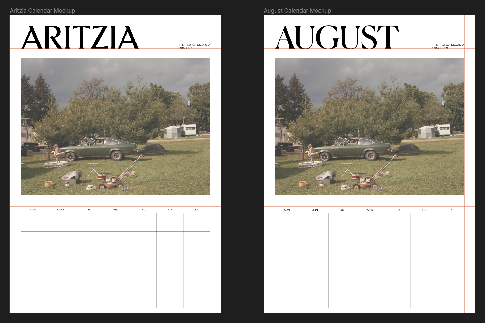

I ensured that the artist was credited and that the appropriate calendar date information, including the month and year, was correct. Mirroring the size, placement, and relationship between images and text seen on the original Aritzia shopping bag allowed for harmony in the composition.
Wall Calendar Mockups


Explorations
Not satisfied with a simple wall calendar, I brainstormed about other physical forms that can be interacted with. I observed the designs of other offerings including store gift cards and noted the differences in size and text placement.
I then proceeded to combine the idea of the bag and card into another usable artifact with a smaller footprint: a desk calendar.
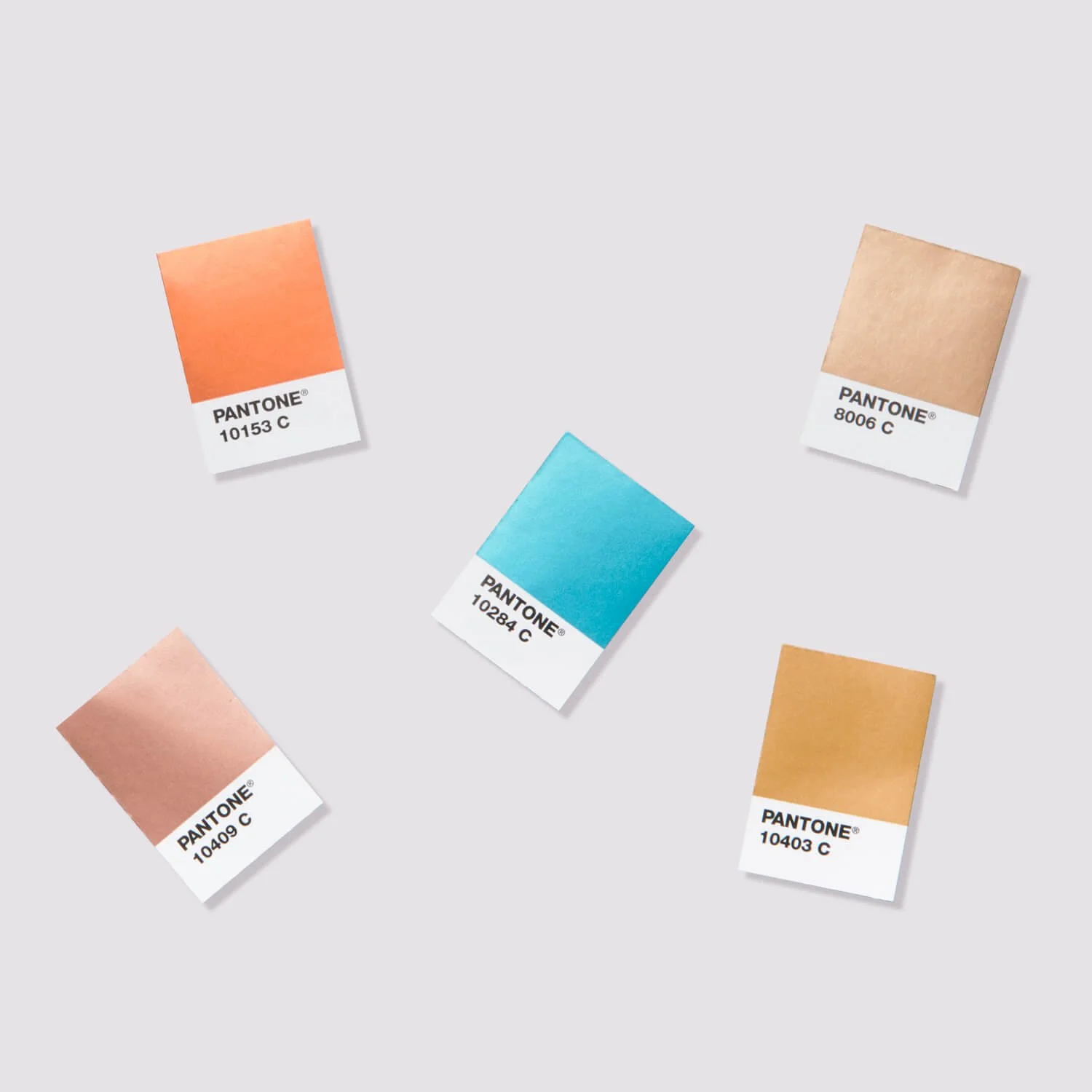
Moodboard
Taking inspiration from other visual sources while keeping true to the Aritzia brand, I looked into combining a compact tearaway segment with a rigid tent-shaped backing.
(Images taken from Pantone and Damien Chazelle’s film La La Land)


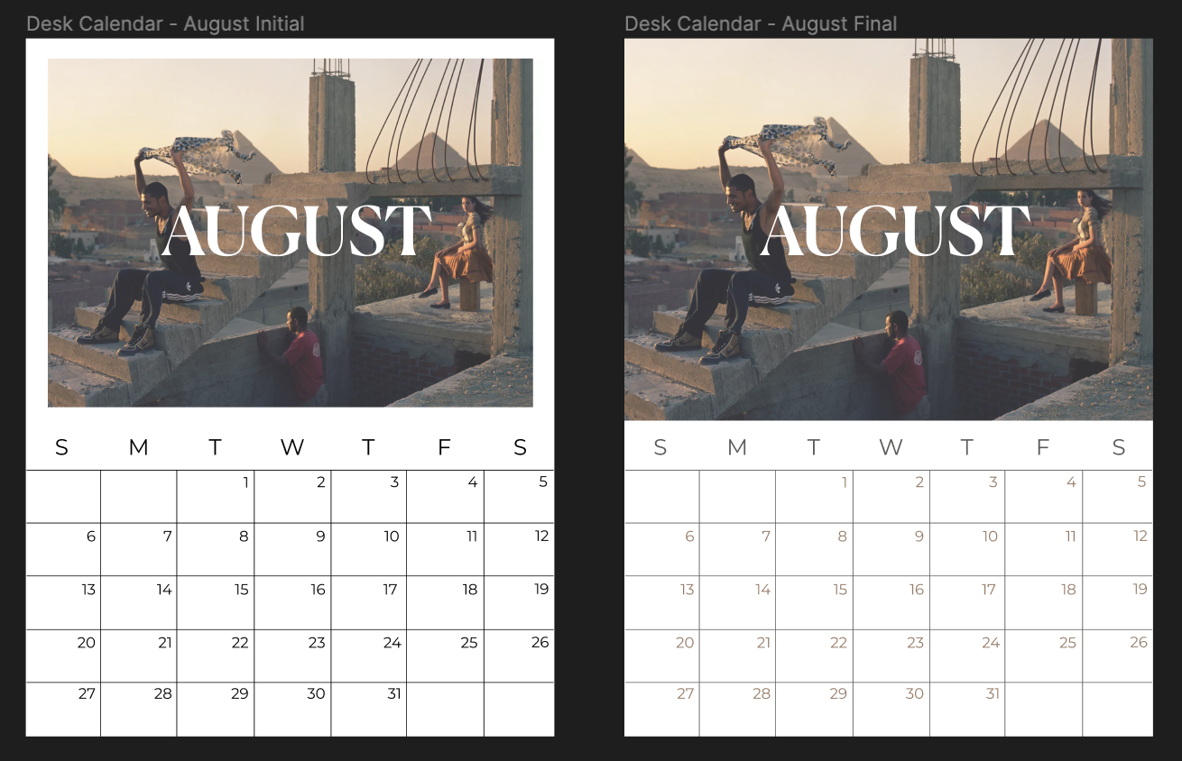
For the tearaway calendar section, I opted to place the month’s name in the middle of the image to remain visible at a glance. I also fine-tuned the date portion by selecting subtler colours that would match the upper section’s palette.
Iterations
I made multiple adjustments to each image placement for the calendar backing and its relationship with the Aritzia wordmark. Taking cues from existing merchandise was the key to finding a harmonious balance.
Final Mockups


Reflection
This exercise challenged me to work within existing brand guidelines to match a company’s visual design. I was able to practice creative ideation in the print space while keeping feasibility in mind. If I were to make any changes, it would be to incorporate the recycling of existing Aritzia shopping bags into these functional pieces through pre-made perforations and cut lines. Overall, these products were a joy to create.
All images featuring the Aritzia brand and photographs used in the product mockups are taken from Aritzia.