DIALOG
A multidisciplinary Vancouver studio taking a collaborative approach to designing, with communities and the environment in mind.
Roles: Layout Design, Copywriting, Branding
Tools: Adobe InDesign and Illustrator
Context
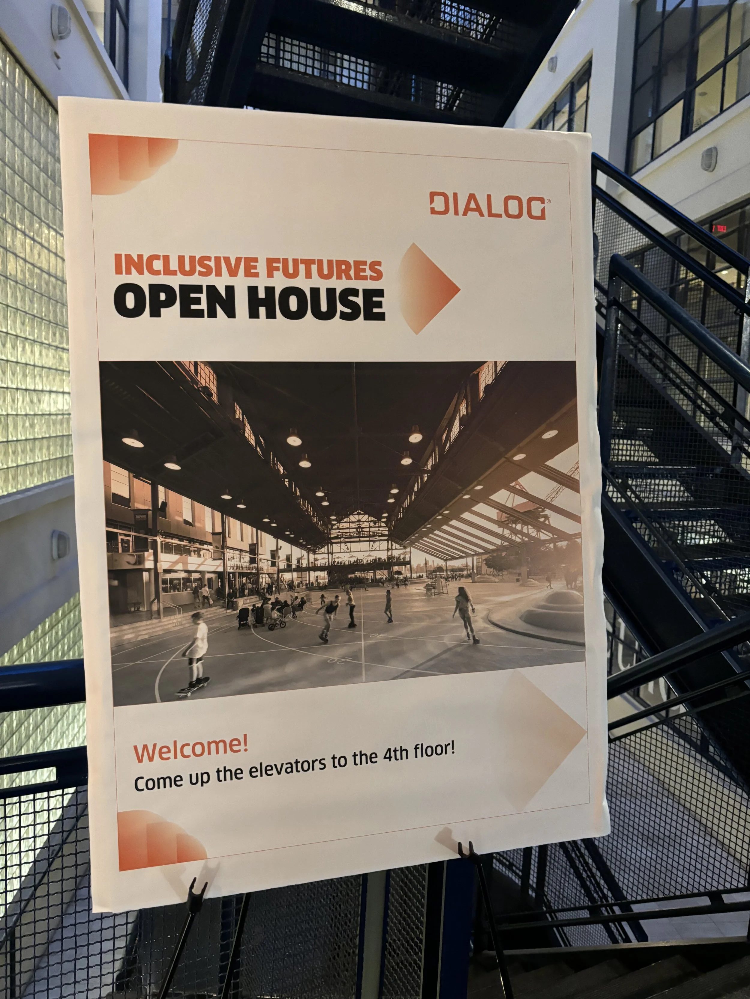
DIALOG is an award-winning firm with work spanning multiple disciplines within architecture, engineering, interior design, landscape design, and urban planning. Known for their commitment to great design, as seen in their placemaking projects such as Granville Island, The Shipyards, and Rainbow Park, we explore how these ideas are brought to life.
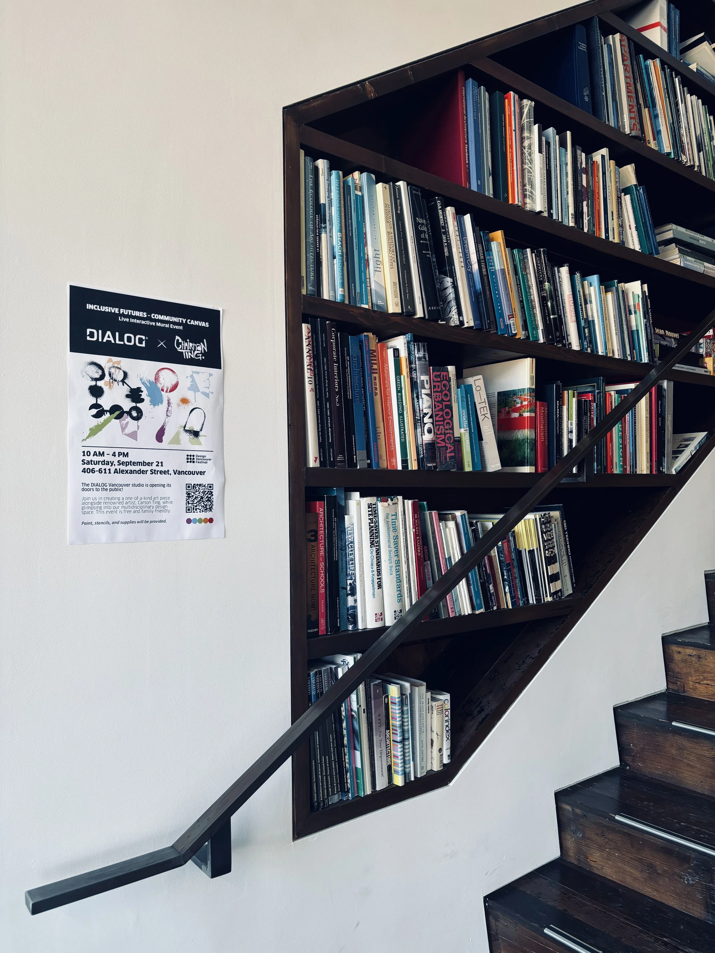
As part of the Marketing team, I was given graphical ad-hoc tasks with minutes sets of instructions. Make a display. Create a poster for this event. Given virtually a blank canvas, the rest was up to me.
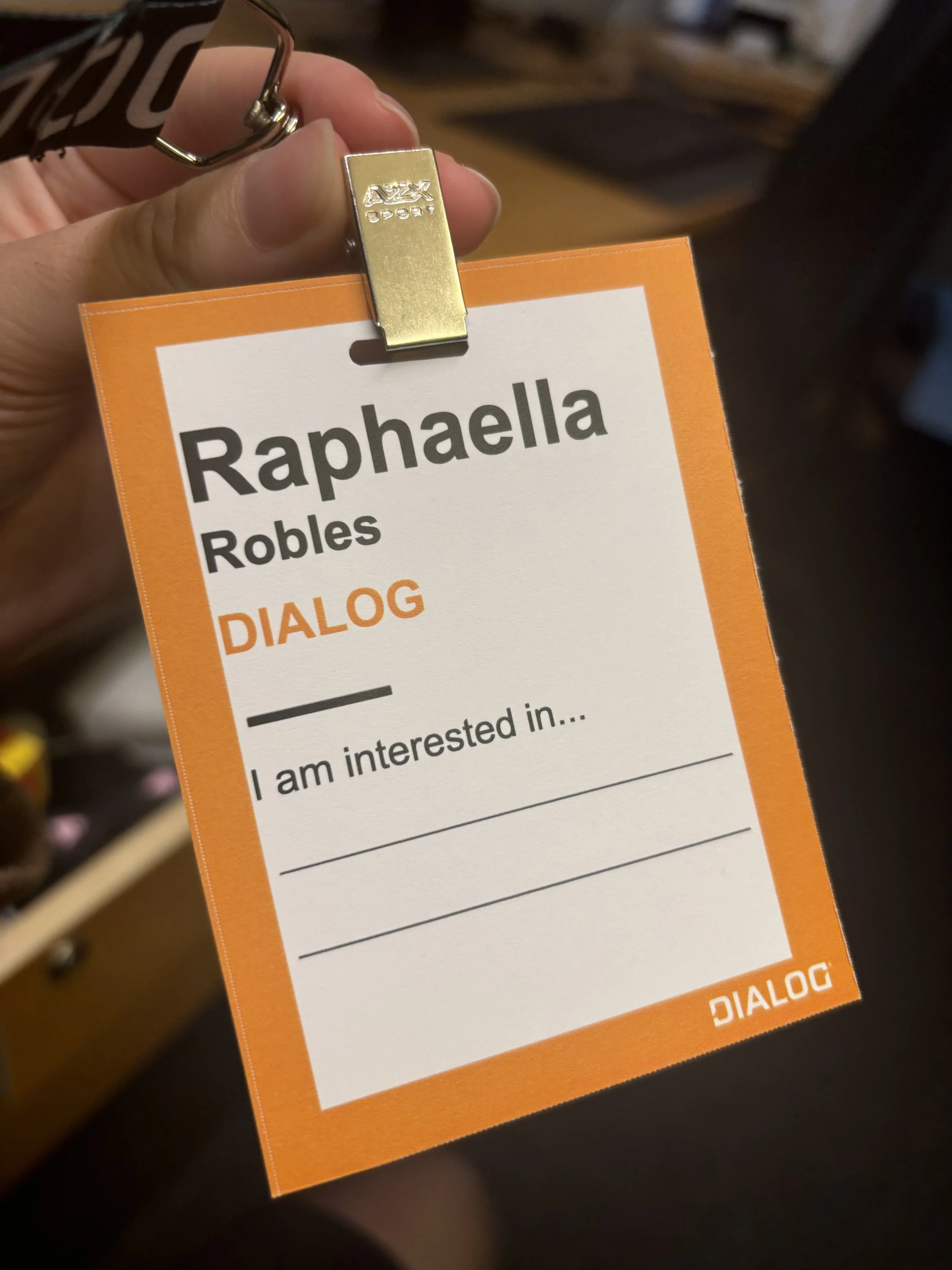
Standard nametag for client event
Experimenting with new formats
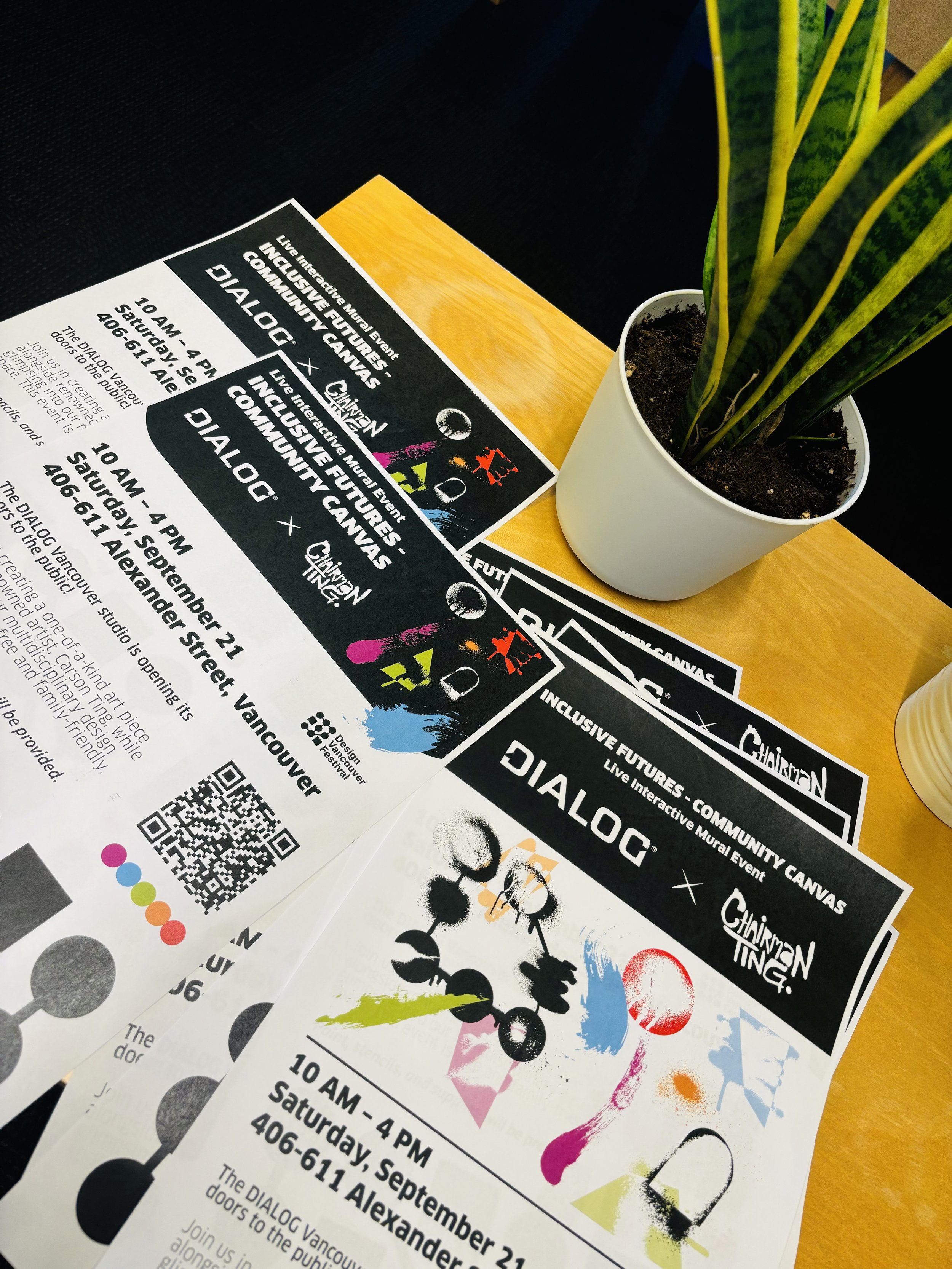
Explorations
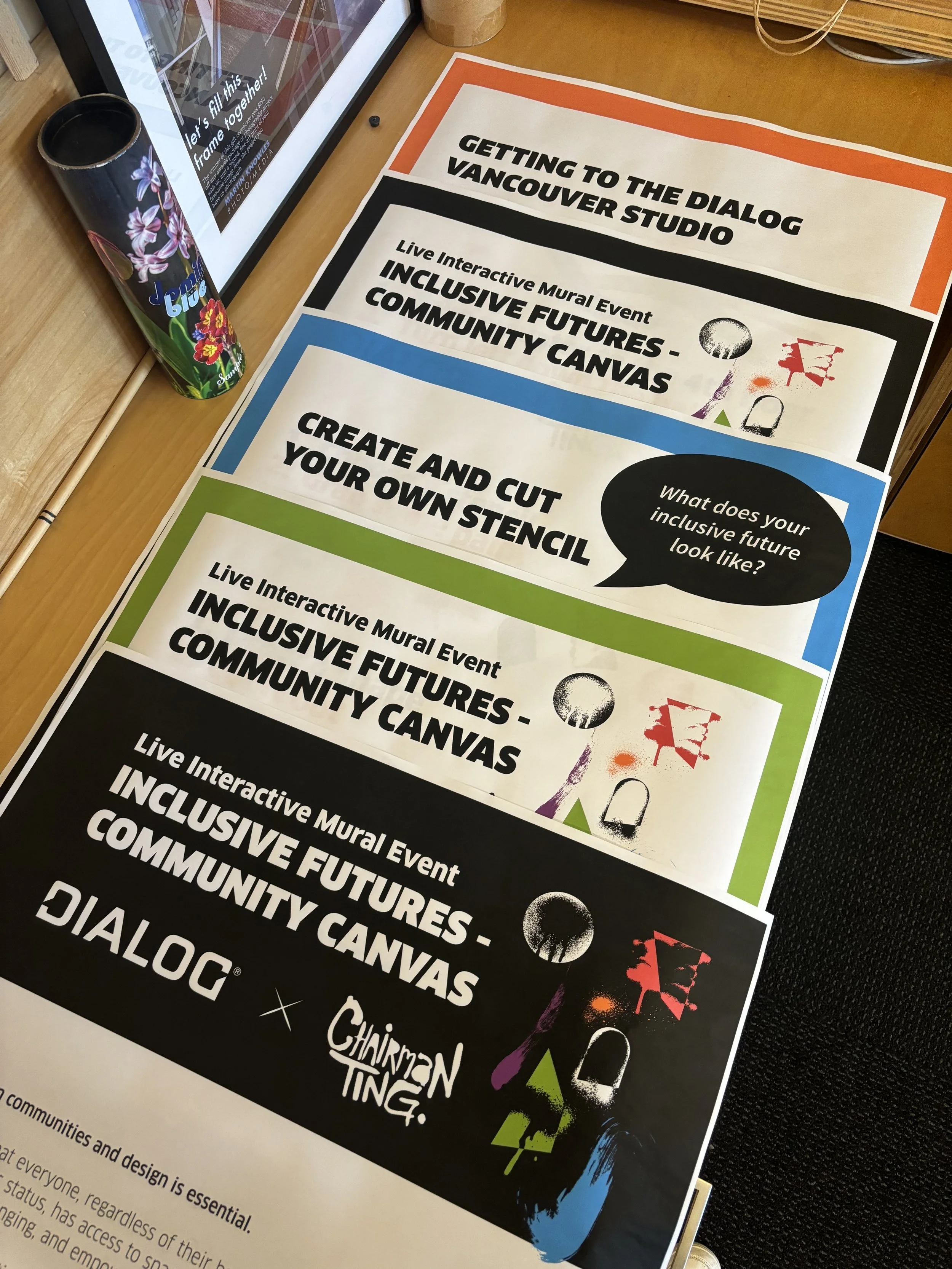
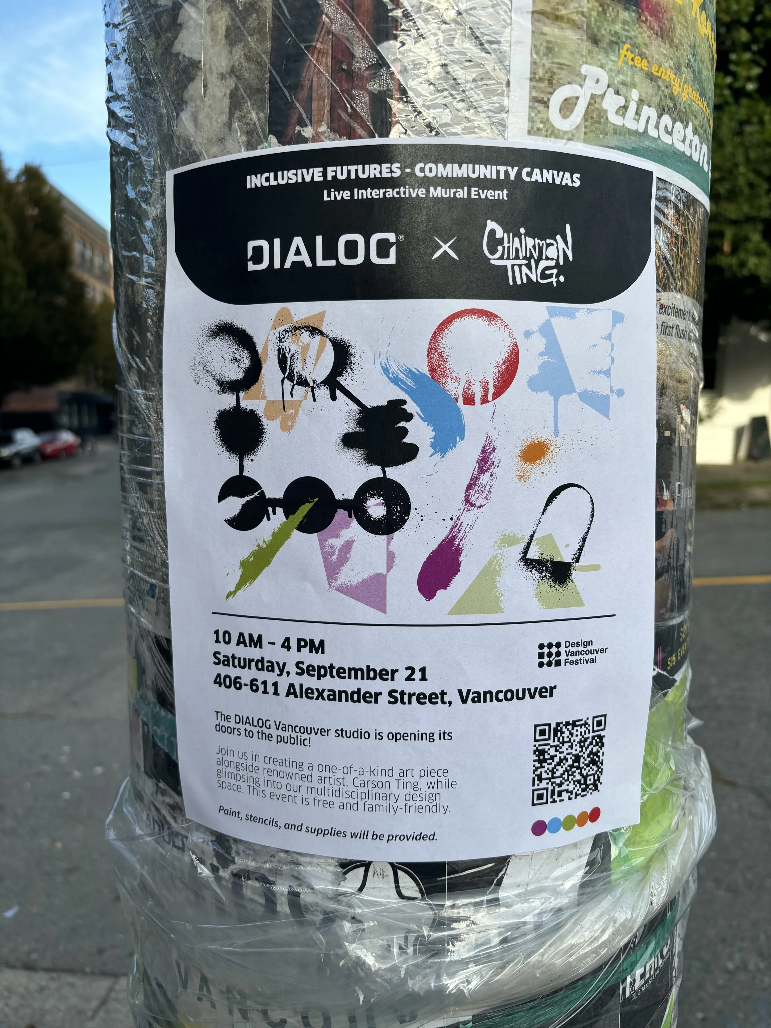
DIALOG’s marketing and branded collateral feature two main components: their font and their colours. With these rules in place, sometimes printed materials are left uninspired. When I was tasked to create materials for DIALOG I took it as an opportunity to break out of the mold. I played with different shapes, arrangements, and blending options, seeing what I could do to add creativity into the brand of a renowned design firm.
Goals
The redesign aims to highlight clusters of information while providing a generous amount of space. By reorganizing content fields into widget-like elements, each prompt is given its dedicated area while leaving room for branding.
This includes:
Pushing elements to document margins but maintaining a consistent grid
Keeping branded elements on a separate layer to maximize the space for hand-written notes
Creating clearer microcopy for calls-to-action

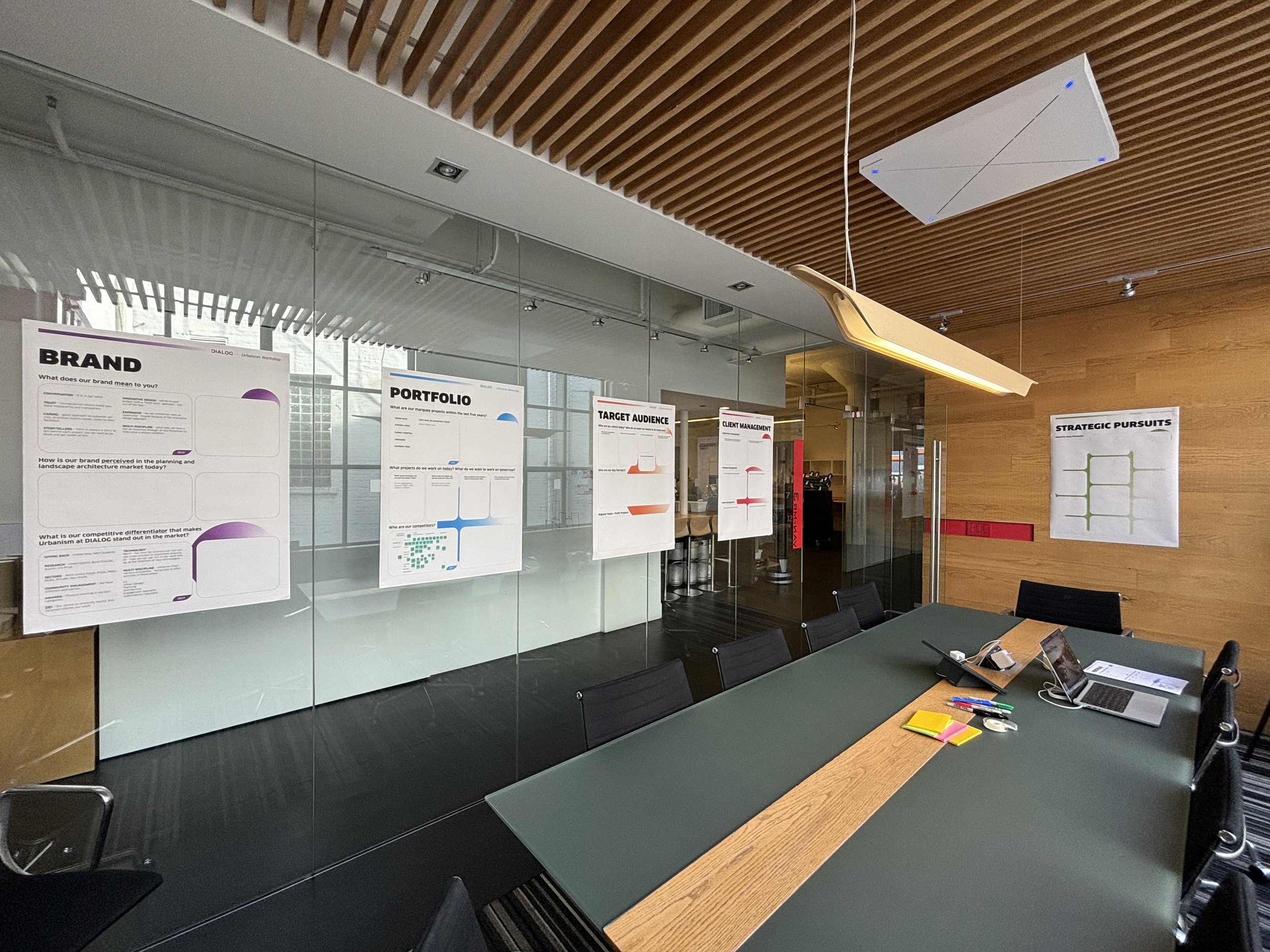
Past Workshop Boards

Redesigned Posters
Solution
Create a visually compelling set of printed signage that utilizes DIALOG staples such as their proprietary font and colour palette while introducing new graphical elements to capture audiences’ attention.
The result
Reflection
For change to happen, I need to remain curious. Studying what makes posters and signage effective for client and community events proved to be an exciting exploration for the DIALOG brand. Although opportunities to be creative are somewhat limited in a corporate space, I was able to push for visually impactful designs that showcased methods of communication in a different light.